
![]() So, as we all know, I have problems. One of those problems is insomnia. Another problem? I like to read.
So, as we all know, I have problems. One of those problems is insomnia. Another problem? I like to read.
Those two problems sometimes combine into an unstoppable force.
When this happens, I often find myself in bed, reading Reddit.
And, because using a computer while pretending that I’m totally going to sleep, no really is uncomfortable, I’m usually reading Reddit on my phone.
We also know that I have this blog.
These two things combined last month into a truly cunning plan: why not download all the Reddit apps and see what they’re like, and find one that isn’t 100% intolerable.
So, I did that.
First, some more background, though.
I will be inconsistent, because I am me.
I will fixate on shit that probably does not exist, because I am me.
I will be reviewing from my perspective, because I am me.
Wait, what does that mean? Oh, right: from the perspective of someone who isn’t commenting, posting, or being social at all. I am there to read, whether it be batshit fan theories, creepy stories, or drama.
I only have an account so I can save threads and subscribe to subreddits. I’ve tried commenting, and I don’t think I’m cut out for being social over there.
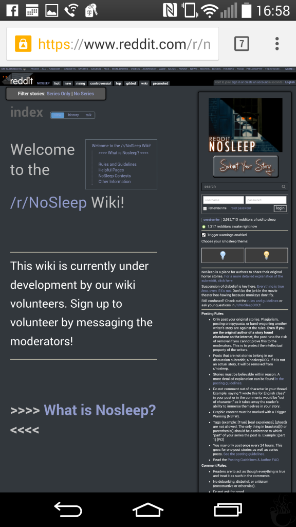
So, with that in mind, let’s begin. With the mobile edition of Reddit.com…which I kept getting bothered about while testing other apps.
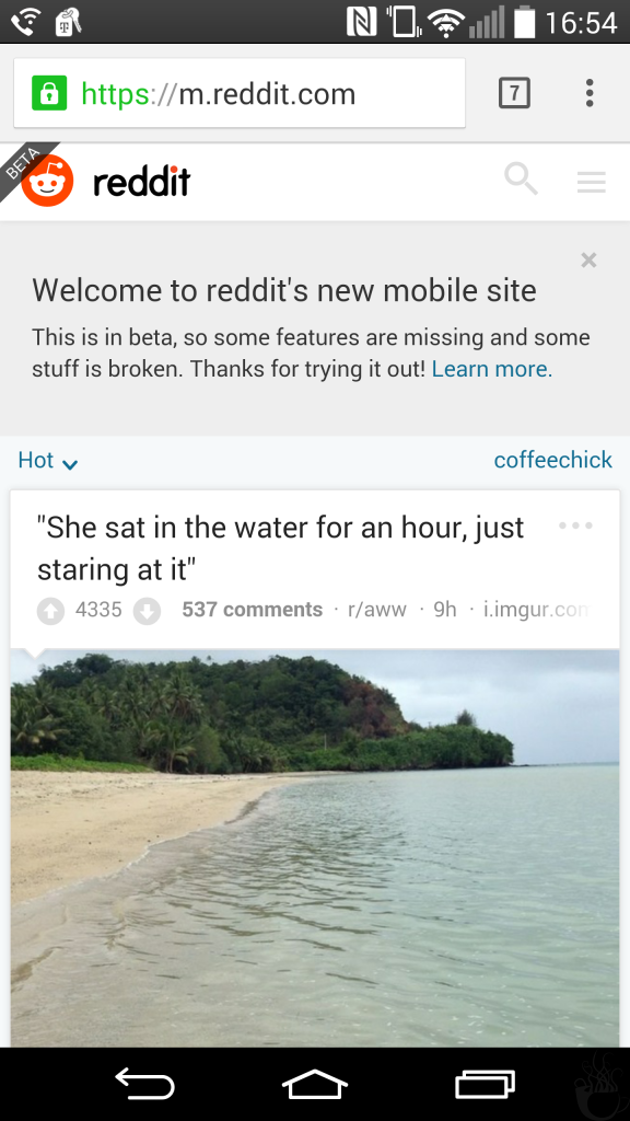
There it is. m.Reddit.com.
Obviously, it has landscape mode, because we’re in Chrome.
But who uses their phone all sideways like that, unless they’re watching a video.
There is an option to make things less…ginormous, too.
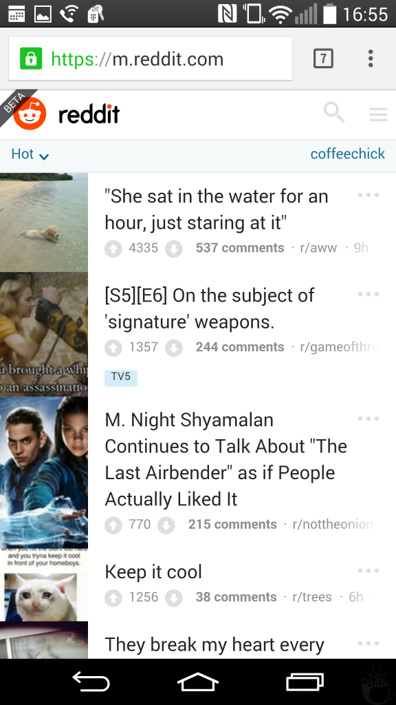
Which is slightly more tolerable.
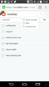
That right there is the menu, by the way. How you get to all sorts of important shit.
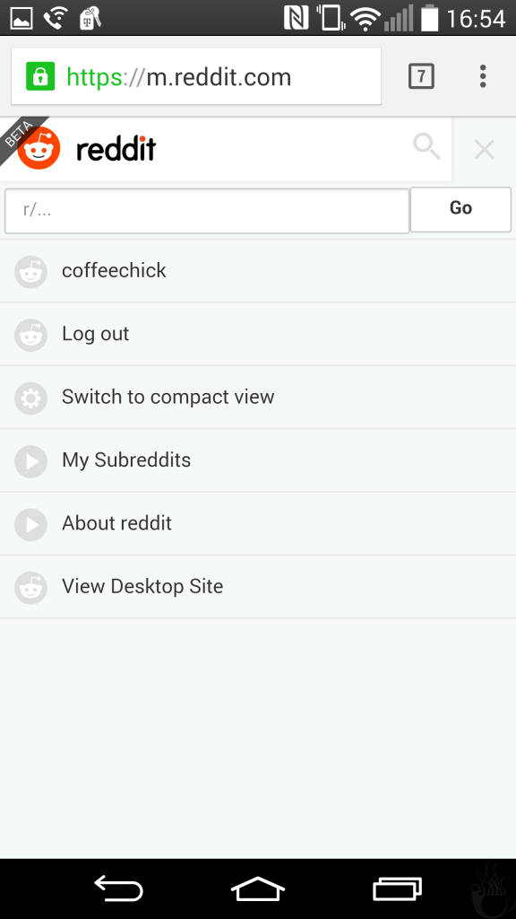
Like switching between list view [the first version] and compact view [the smaller, more tolerable version], or your subreddit list. You can also type in a sub name and go to it, but who does that?
Let’s see how a post looks….
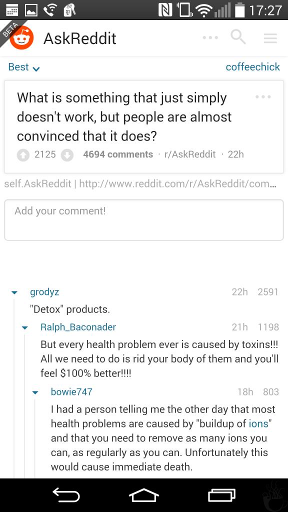
Kinda like a post. But who cares about posts–especially here. It’s all about the comments here.
And when I’m reading comments, I like to collapse the ones that I’m done with, because I’m done with them. I have read you, and now I shall put you away, or something. It’s a thing, and I absolutely must be able to do it.
And I can. This is a good thing.
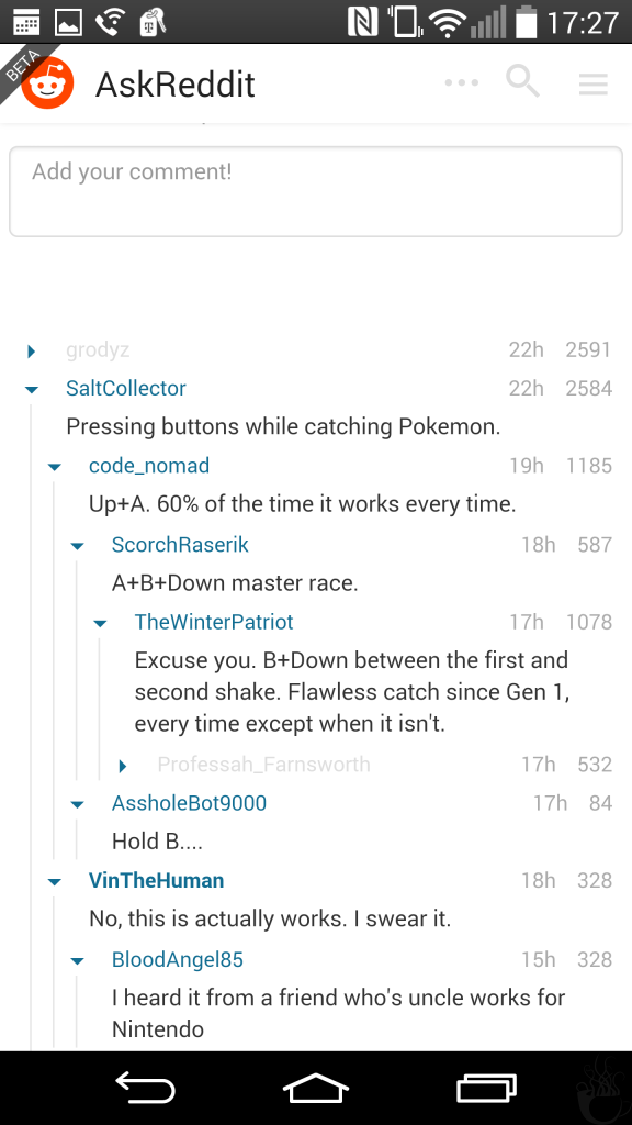
Bad thing, though: if I accidentally hit ‘back’? It forgets what I’ve collapsed. This will likely be a complaint with everything, because holy shit do I hate it when I accidentally ‘back’ and lose my place.
I don’t even think that you can do this on a computer, in a proper browser, with Reddit Enhancement Suite, though, so this may be me hunting for a fucking unicorn.
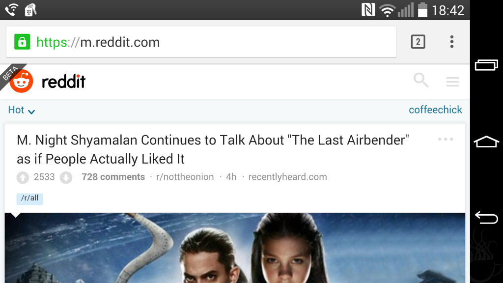
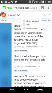
Next thing to check: does it show Flair?

It does. That was easy.
Let’s fuck off for a bit.
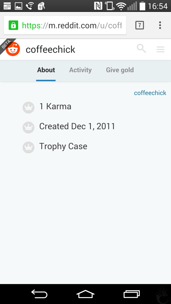
I can view my own profile. That’s interesting.
Or depressing. Or evidence for that groundwork I laid up there. I am really fucking inactive over there. I don’t upvote or downvote. I don’t really comment. I treat it like a library.
And I don’t go to the library to make friends. With people. I go to the library so I can spend even more time shut away from people, reading books.
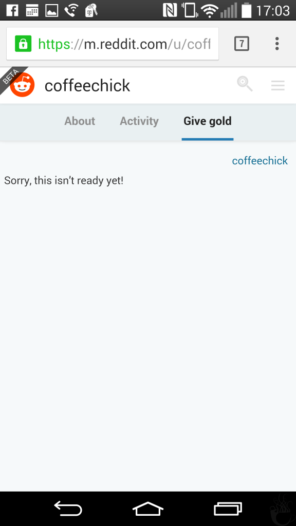
I clicked on ‘give gold’ just for the fuck of it, and discovered that the feature isn’t ready yet.
Not here for gold, anyway. Here for reading.
This is where I start running into irritations, by the way.
First, I’m clicking–tapping?–about, checking things out in various subs, just testing things, and I notice that one of the menus likes to stay open for no reason, sometimes showing the previous sub’s information.
Which, okay, weird glitch, but whatever. No big deal.
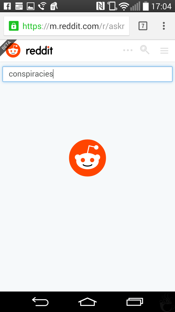
Then my phone loses its damn mind when trying to access a subreddit wiki.
I guess I kinda just installed a bunch of things. Maybe this confused the phone a little. No big deal. Open that shit in Chrome.
…which brings us to the most glaring issue. This image, contrasted with all the previous images.
See the difference?
Yeah. Everything else is blinding white. Which I hate. So much.
There’s no dark mode for the mobile website.
Also, I can’t access my saved posts.
These two things combined? Very irritating.
But, fuck it, there’s a search option, and I’m still trying to pretend to be professional and diligent here.
Um….

…shit.
It never loaded.
And the animation that transitioned between the r and the little robot was nowhere near entertaining enough to hold my interest.
That was pretty much it for me.
While it had some basic functions–the ability to log in, and the ability to collapse comments–it was missing far too many things that I consider to be basic essentials–access to saved posts, a search function that actually loads–to be usable right now.
The lack of a dark mode is also a problem for me, as is Chrome’s insistence on not being helpful about faster scrolling–say, to the root or the parent comment, or the top of the page.
It also just felt plain wrong. It felt like I was browsing a cut down version of the desktop edition…which, technically, I was. But part of the cuts were the things that I’ve come to expect from RES, which made everything painful and obnoxious. And slow.
And entirely too flashy, with the ‘pay no attention to how long this shit is taking’ animations.
You’re only drawing attention to how long I’ve been fucking waiting, guys. Stop that shit.
It was a bit like paying for a full internet/television/phone package, and then using the VoIP line for AOL dialup.
It may improve at some point–it’s still in beta, after all–but I kinda get the feeling that apps are the way to go. And there are a lot of apps [many of them apparently projects abandoned in public alpha stage], so I’ll have more pointless, image-heavy content.
This should be fun. Or, at least, fun-adjacent.